With the rise of online media and ability to market across broader geographical spectrums then once possible without publishing houses and distributors, Self-publishing autobiographical, fiction and technological books is a growing phenomenon. One client realised there was a market for providing high school students resources to improve their grading for Tertiary entrance.
The UMAT (Undergraduate Medical and Health Professions Admission) Test is a three-hour test and is one of three criteria for entrance to University Medical Education. Having done the work of writing up three books of sample exam questions for UMAT to be providing an advantage to motivated high school students, my client needed a logo and book covers.

As there were competing courses available for students, my client needed to undercut the expense inherent in pre-training coursework and provide motivated students with a resource in an affordable price bracket. A Book facilitated students reading and practising exams samples to understand not only the structure of the questions but the style of answers being sought.
He had some ideas as to what to call the book and a few loose ideas on logos. These included: UMATCH, UMAT and UMATLAS. As we explored each of these, we finally settled on UMAT Advantage
Typography
Regimented school syllabus, very familiar to school children requires a font that is associated with substantial training and regiment of rote learning that characterises school life and training. The Gotham font is a strong, robust font that has a history in well-recognised signage in the urban landscape. It has a relatively broad design with a reasonably high x-height and thick stems that would lend themselves to natural distortions to facilitate converting into a font based logo design.
Logo.

School exam results on paper are dominated by two particular symbols, the tick and the cross. Focusing on the proposal the book would give students an advantage we went with the word “Advantage” in the Gotham Font. The solid nature of the font allowed an easy manipulation of the vertices on the depiction of the “v” in Advantage to create a “tick” symbol without departing too significantly from the structure and stems of the font. Hence to create the tick symbol from the “V” all I had to do was delete two defining points on the upper inside of the stem of the “V” and move one point upwards in alignment with the rightmost stem of the letter. Thus much of the font’s characteristic is retained, and the “tick” of approval is illustrated.
Design Cacophony

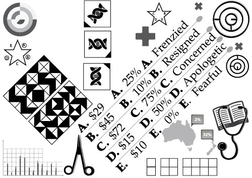
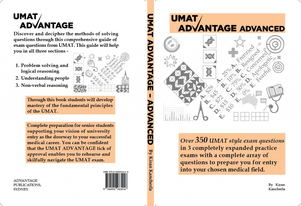
The manual presented all facets of the style of questions representative of the UMAT exams including multichoice queries, logical analogies, psychological profiling, diagrammatic sequencing problems amongst others. By reviewing some of the symbols and problems presented I generated some similar figures and multichoice answers in Illustrator that typified what the student may encounter. Because of the daunting nature and structure of these exams I presumed the buyer was looking to find a sense of what, they as high school students might image a maelstrom of questions dauntingly blocking their way to admission to a medical career. Placing these symbols in a haphazard, random pattern on the book covers was to provide identification with student thoughts and represented the disarray of thoughts and anxieties they faced. The more ordered text is explaining the book on each cover a promise of bringing the chaos under control. A few medical symbols were thrown in to give it the context of preparation for a medical career.

Results.
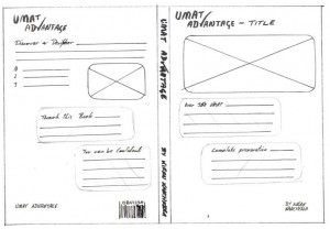
After some reworking of the positioning of symbols at my client’s direction and the creation of three different versions of each book; the book covers for each were designed and forwarded to the printer. My client has a website now promoting the books and the “UMAT Advantage” it provides students.

N.B. This client is still in operation and has since created a website (with no assistance from myself) from which he sells his books which can be found at http://www.umatadvantage.com.au/