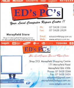
Taking an existing design and reinvigorating it with more contemporary and relevant design for companies as they grow and evolve is a common need in fast moving dynamic environments. We can’t take longevity in business for granted. So reinventing oneself and one’s business is tactical for survival. Take the following case of two business cards for example…

The problem was some existing business cards that belonged to a business being bought under the auspices of a new owner. The new owner wanted something more engaging that better reflected the business. (The logo was not up for re-engineering, so one could not — despite wanting to — “touch it up”.)
ANALYSIS
Typography
The tagline was in a script style font for a Computer/Hardware sale/repair business. Appropriate if you are selling art or flowers. The font needs to have associations of solidity, dependability, efficiency, forward looking. For that, I looked at the Futura font.
Images
In the old cards this consisted of lines and wispy smoke blue backgrounds that were more reminiscent of ephemeral, drifting, easy going businesses. Though probably not consistent with impressions of serious engineering and solid craftsmanship. Perhaps a few engineering gears and cogs and strong geometrical shapes might lend itself to a different perception? The PC image is good and simple but perhaps needs revamping to a more modern image of machines in the market now.
Colour
Blue is a solid colour suggesting trustworthiness. Other emotive impressions are dynamic or fresh. One wants to have customers feel that they can trust the owner to fix their computers. It is already in existence in the logo and from the design perspective of repetition, and not departing too far from customer associations; there was cause to maintain this. The Blue and Orange that are on the logo represent what is known as “complimentary colour sets” in design language, meaning that they are on the opposite sides of the colour wheel. This gives them the highest contrast levels. Repeating these colours in the redesign maintains all these associations.
Layout
Small consumer based computer sales and repair companies are a dime a dozen and the names are many and varied. Being customer centric and – given someone’s Rolodex probably has dozens of these cards – the tagline for the firm’s service is of probably greater use to engage the customer, than the business name. What is on the top of the card will be spotted first a customer is leafing through a Rolodex, card box or their wallet. The geeks amongst us may know who Seagate, Asus or Netgear are, but do the consumer market know or care? The question should be, is the card to engage us or our customers? Multiple email addresses (although admittedly defunct for reason of change of business owners) will leave the customer wondering which one to use. And, finally, does anyone use a fax nowadays?
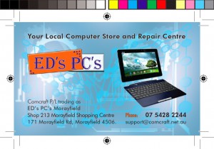
The redesign
Background images of gears and circuit boards were incorporated, and the tagline was placed top and centre in large font. The logo below the tagline as it is on the shop front and is an established business identifier. Real estate address was placed one side and contact information on the other. Keeping it simple, with a single phone number and e-mail address. The result is shown below…

N.B. The business owner who commissioned and used this card is no longer operating this enterprise, and the details are only accurate in regards the period in which the owner operated. The contemporary accuracy of any information of this case study cannot be guaranteed.