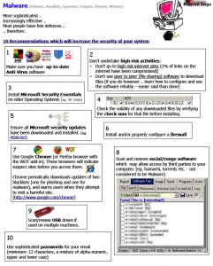
Businesses often create small newsletters electronically or in print to engage their clients on matters that they may apparently be concerned. This being to inform them and provide added value as a consequence of being that business’s client. For example, a client who ran a computer store had produced a newsletter about Malware to keep his clients up-to-date with the intrusions of viruses, spyware, trojans and the like. One of the crucial aspects of good design is hierarchy and alignment. Alignment provides structure and legibility to information, perhaps displayed in grids, columns or rows or whatever may provide it in an orderly fashion. Hierarchy is something that aids the path of navigation in design, starting with the masthead usually with the most significant font and subsequent heading sizes depicting levels of importance or relevance. Hierarchy tends to dominate issues of typography and used correctly is a hook to capture the attention of the reader.

So when this computer company gave me this document looking as shown herein, the first thing that stood out were issues of hierarchy and alignment. Then perhaps issues of balance. By this, I am referring to the distribution on the page by the placement of elements. Just because one can put points of information in cute little boxes because the word processing technology allows you to, doesn’t mean one should.
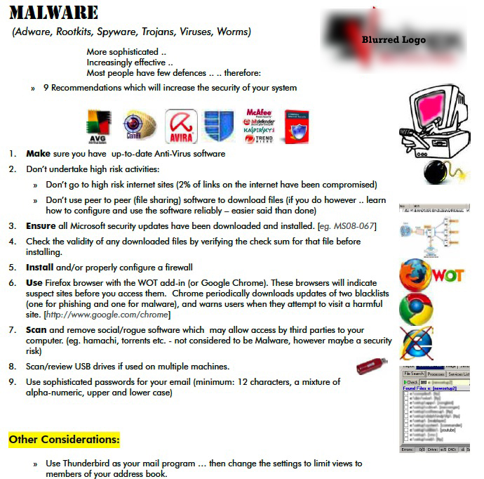
Separating the images and text and disposing of the boxes was the first step. Taking simple consideration of hierarchy of fonts and the easy alignment of a simple list This allowed for a better use of the space and a more comfortable read for his clients. It was a double-sided document which gave some very alarming examples of frauds scamming customers and the infection rates of computers, all similarly boxed in oddly shaped rectangles. I set up the information to the left creating a “sidebar” of images related to the content in alignment with each point.
The information was more readable and hopefully engaging to his audience. As it is indeed still very relevant information – you as a computer user – should make a note of it. I have therefore produced the rework of the first page as a larger image.
N.B. This information is dated, and this does not reflect the current business owner’s enterprises
