Branding clarifies the symbols, colours, logos and form that identifies your company and it’s products. Branding is an vital identification factor in potential customers recognising you and becoming instinctively aware of what you represent.
The client represented here are a small group of property developers who have enjoyed success in building some loft condominiums in ageing industrial buildings and warehouses. They were exploring plans to moving to create a similar business in another city. The demographic to which they wish to appeal is the young cutting edge trendy people who enjoy the energy of the city. Although not wanting to disenfranchise investors and public bodies who wish to be assured of the security of investing in his condominium project. They were looking for something stylish and corporate in their branding. The commission was to design a new brand identity and associated collateral material.
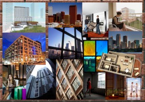 Visual Moodboard
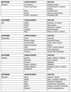 Words to images
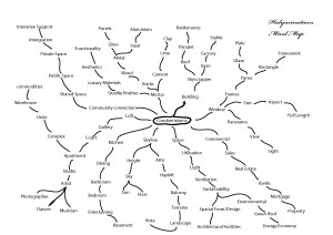
The combination of word association lists beginning with the idea of condominiums and pictographic mood boards to capture the visual sense then allows one to pursue connections and associations with the words and images. This all facilitates the generation of ideas and visuals a designer may utilise.
After the standard word associations and analysis shown herein drew “Habitat Vista” from the early ideas “cards” the “Habitat” was dropped for a simpler invocation of the idea of what their buyers were looking to appreciate for the balconies of their loft condominiums. Once “Vista” was settled on we then looked for the typography to reflect architectural design. From draft sketches, the ideas can be translated into computer-generated alternatives.
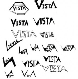
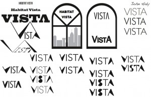
===>
In due course, I presented three options for review to represent the branding choices.
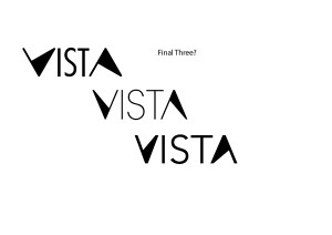
The final logo brand went onto the business cards and stationery. (Please note: the name, address and phone number have been changed from the original to a completely fictitious address while the typography and styling of the original has been retained). Here are thee, options of Business cards, presented.
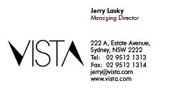
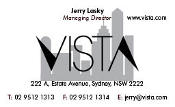
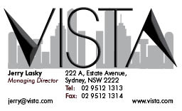
So which do you prefer? There is usually a lot of work that might go into developing brandings and logos. It can be time-consumingly expensive to do it well. Essentially the brandmark objectives were threefold also.
- Vista is about the views available to Jerry’s clients in their acquisition of condominium property overlooking the coastlines.
- It represents no bars on the open spaces and clean luxury of the renovations he creates.
- It represents the arches, clean architecture, strength and support that customers can expect of his developments.
N.B. The address, phone numbers & particulars shown here have been changed from that which was supplied with the original brief and have been deliberately falsified for this case study.